omni-creative.agency

Antithesis

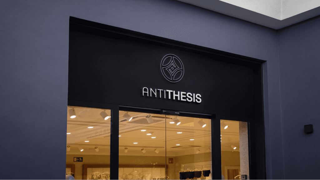
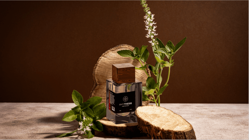
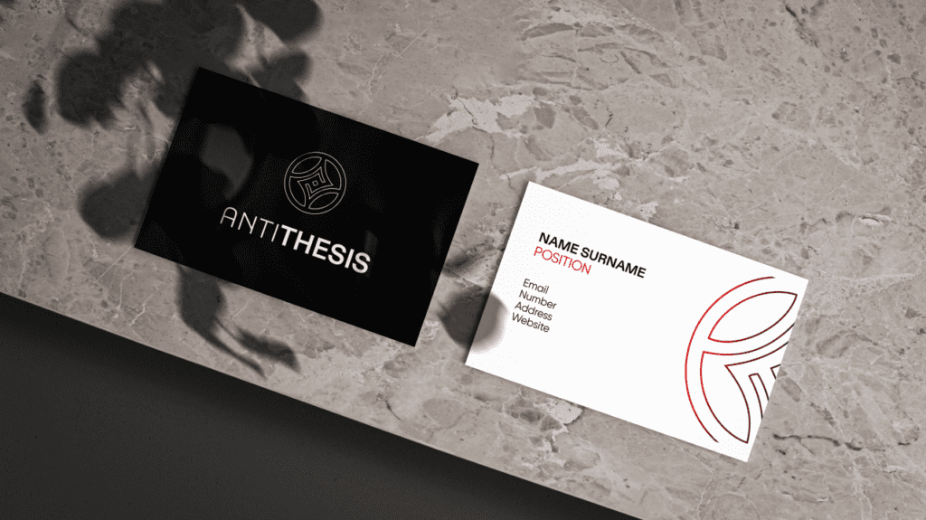
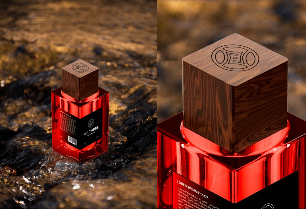
Omni Creative developed the branding for Antithesis Perfume by conducting thorough market research and collaborating closely with the client to capture its essence of elegance and sophistication. We crafted a distinctive brand identity through logo design, typography, and a refined color palette that resonates with its contradictory yet harmonious nature. The final branding package included packaging design and marketing materials aimed at enhancing Antithesis Perfume’s market appeal.

A Byggfornyelse As

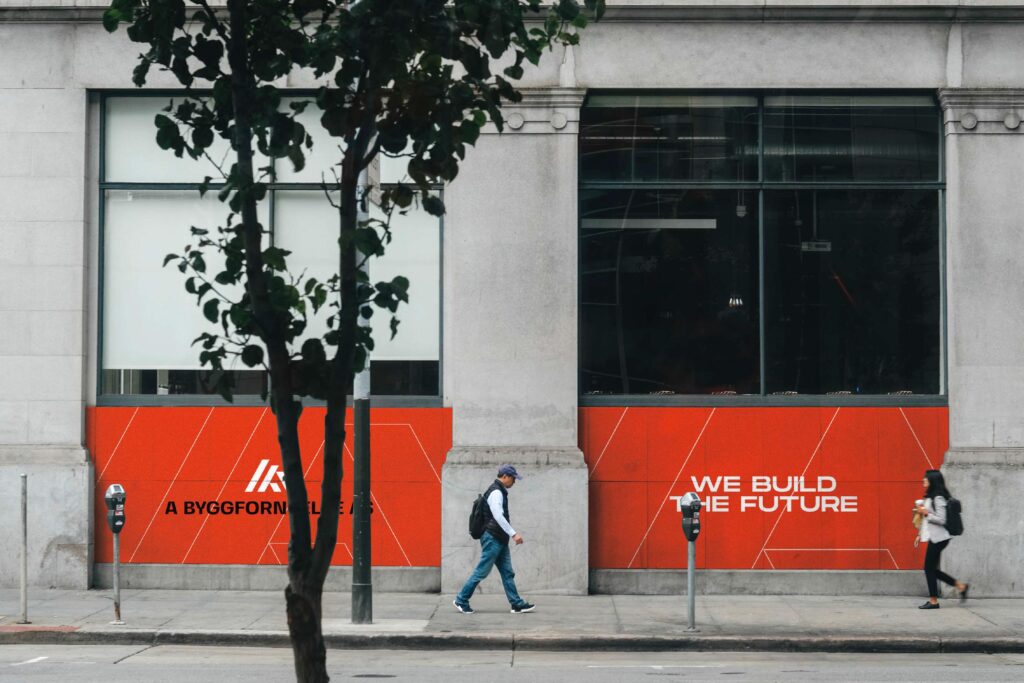
Omni Creative developed branding for A Byggfornyelse AS Construction by understanding its values and target market. We crafted a logo and color scheme that convey reliability and professionalism, reflecting the company’s expertise in the construction industry. This cohesive brand identity was applied across various platforms to strengthen A Byggfornyelse AS Construction’s market presence and appeal.

99 lule

Omni Creative approached the branding for 99 Lule Face Creams by focusing on its natural ingredients and skincare benefits. We developed a clean and elegant logo that conveys purity and effectiveness. The color palette was chosen to reflect freshness and skincare expertise, appealing to a health-conscious audience. Packaging design emphasized simplicity and clarity, highlighting the product’s natural elements and dermatological benefits. The overall branding strategy aimed to position 99 Lule Face Creams as a trusted choice for skincare enthusiasts seeking quality and results.

We are reqruitment group

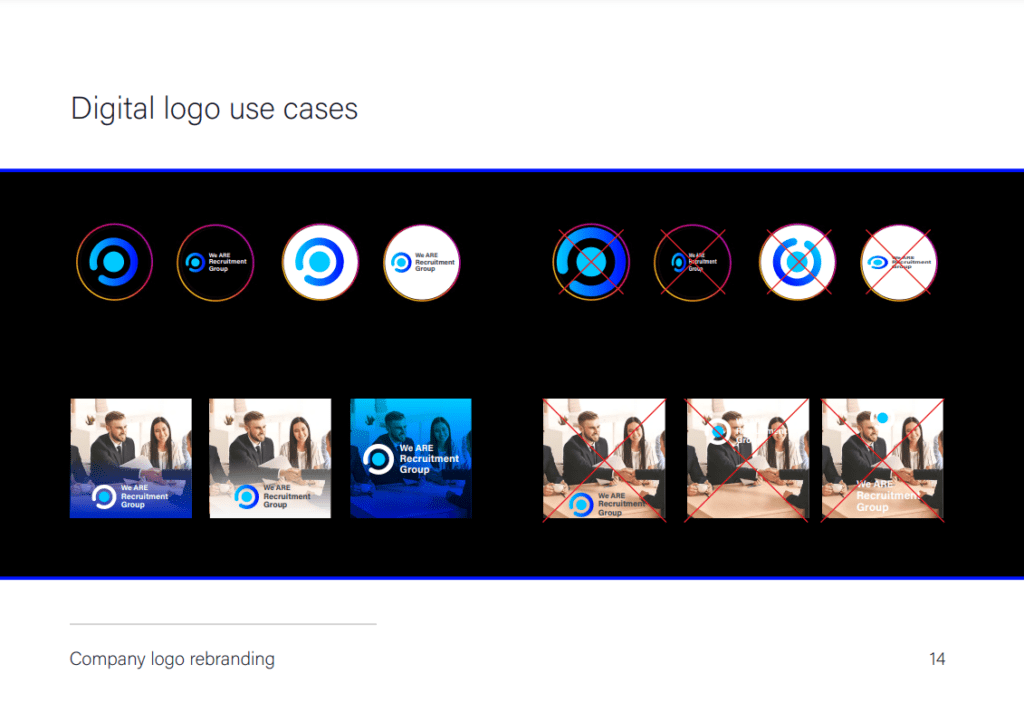
The branding for We Are Recruitment Group with a focus on professionalism and trust. We crafted a sleek and modern logo that symbolizes reliability and efficiency, using a color palette of blue and gray to convey stability and professionalism. The brand book outlines guidelines for logo usage, typography, color schemes, and tone of voice to ensure consistency across all communications. Our strategy highlights We Are Recruitment Group’s commitment to matching top talent with leading companies, reinforcing its position as a trusted partner in the recruitment industry.

we are infotech

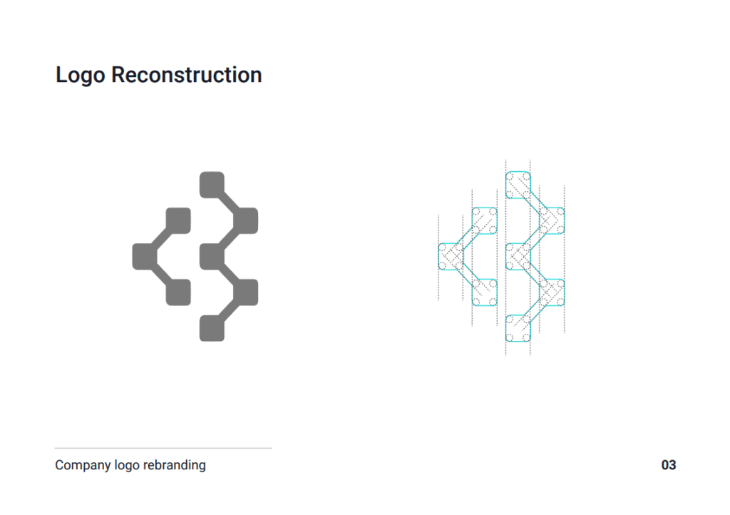
Omni Creative crafted the branding for We Are Infotech to embody innovation and reliability in the tech industry. The logo features modern, geometric shapes and a tech-inspired color palette of blue and green, symbolizing trust and growth. Our brand book defines a consistent tone of voice that blends technical expertise with approachability, ensuring clear communication across all channels. With sleek visual elements and comprehensive guidelines for logo usage, color schemes, and messaging, We Are Infotech establishes itself as a leader in cutting-edge technology solutions, committed to client-centric innovation and excellence.

we are renewables

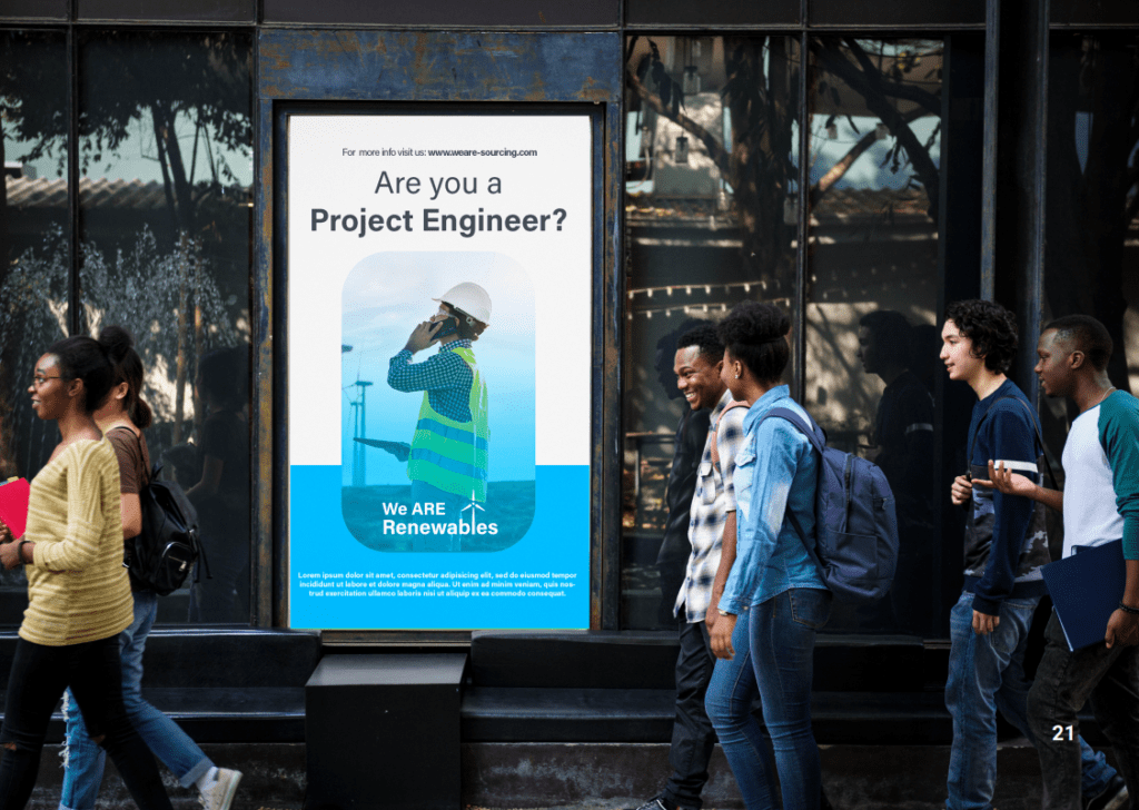
Omni Creative designed the branding for We Are Renewables to emphasize sustainability and innovation in renewable energy. The logo features clean, modern design elements and a color palette inspired by nature, symbolizing environmental responsibility and forward-thinking. Our brand strategy includes clear guidelines for visual identity and messaging, ensuring consistent communication of We Are Renewables’ commitment to sustainable solutions and leadership in the renewable energy sector.

we are life sciences

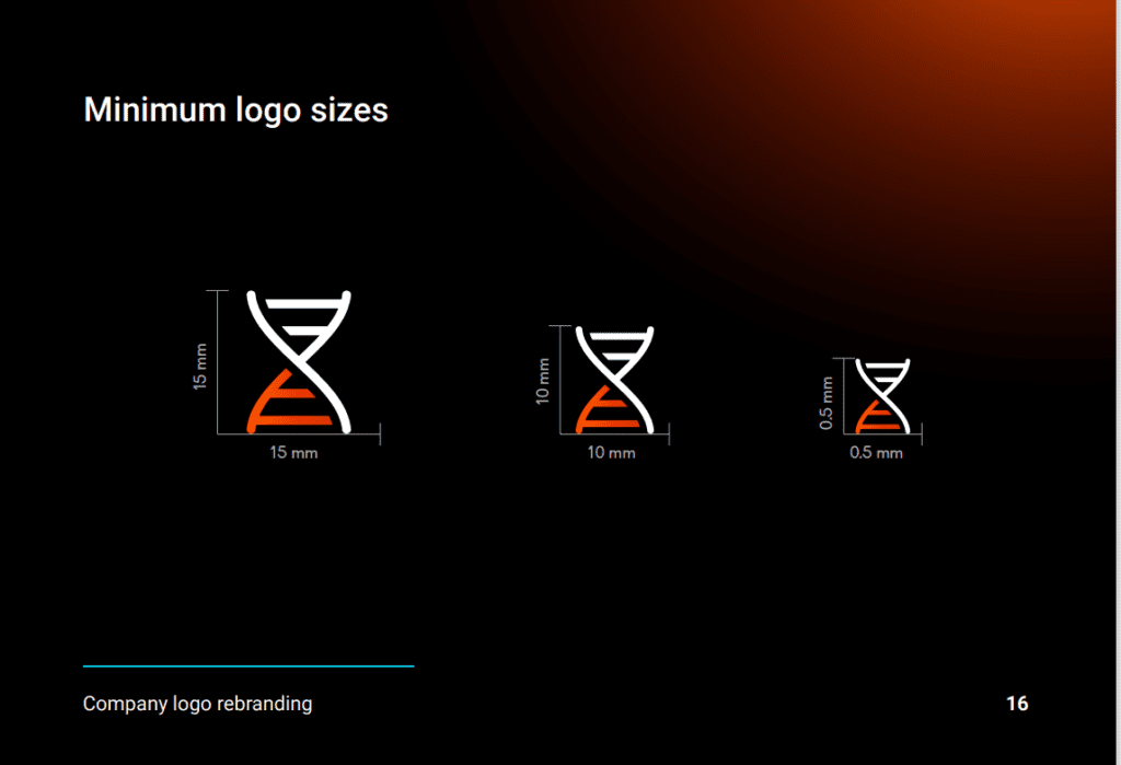
Omni Creative developed the branding for We Are Life Sciences with a focus on expertise and innovation in the life sciences industry. The logo features a contemporary design and a color palette that reflects professionalism and scientific advancement. Our brand strategy includes concise guidelines for visual identity and messaging, ensuring consistent communication of We Are Life Sciences’ commitment to cutting-edge research, healthcare innovation, and improving global health outcomes.

we are sourcing

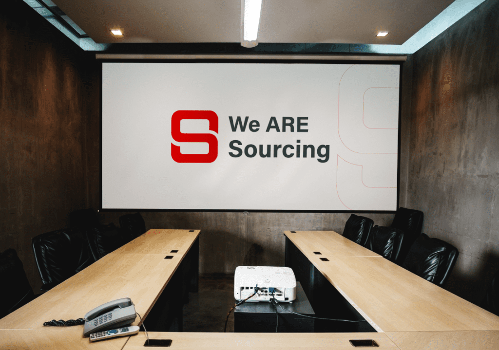
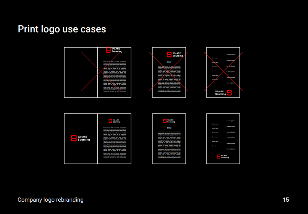
Lorem ipsum dolor sit amet, consectetur adipiscing elit. Sed do eiusmod tempor iprocurement and sourcing services. The logo design is sleek and professional, utilizing a refined color palette to convey trust and competence. Our brand strategy includes clear guidelines for visual identity and messaging, ensuring consistent communication of We Are Sourcing’s commitment to delivering exceptional sourcing solutions and enhancing client supply chains.ncididunt ut labore et dolore magna aliqua. Ut enim ad minim veniam, quis nostrud exercitation ullamco laboris nisi ut aliquip ex ea commodo consequat. 

Opium

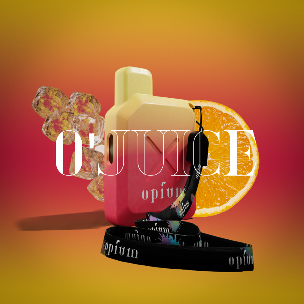
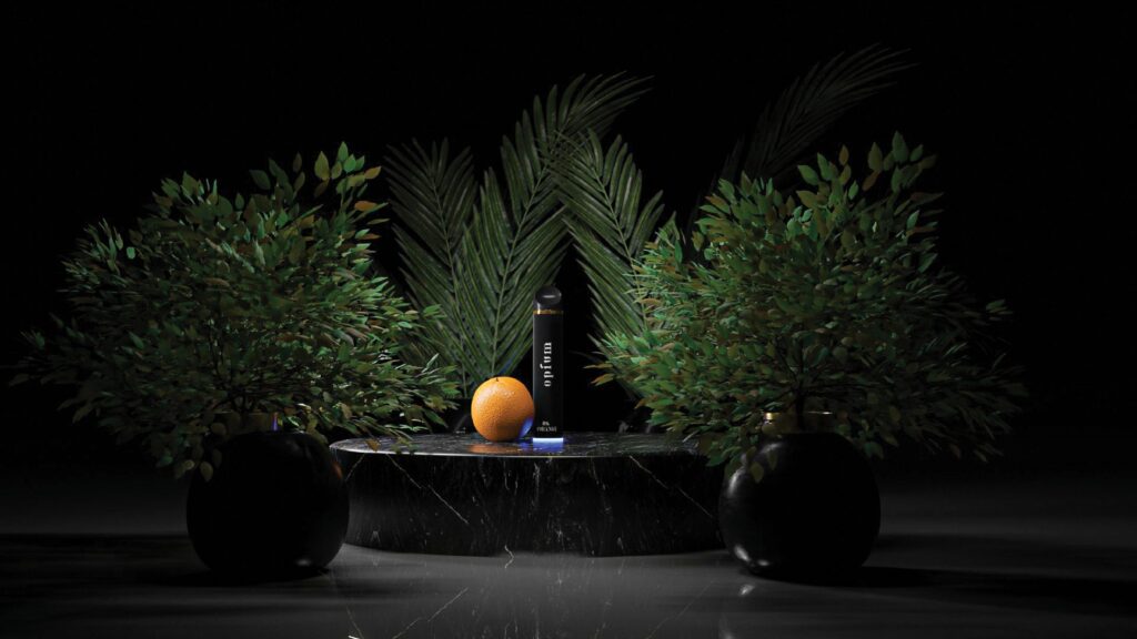
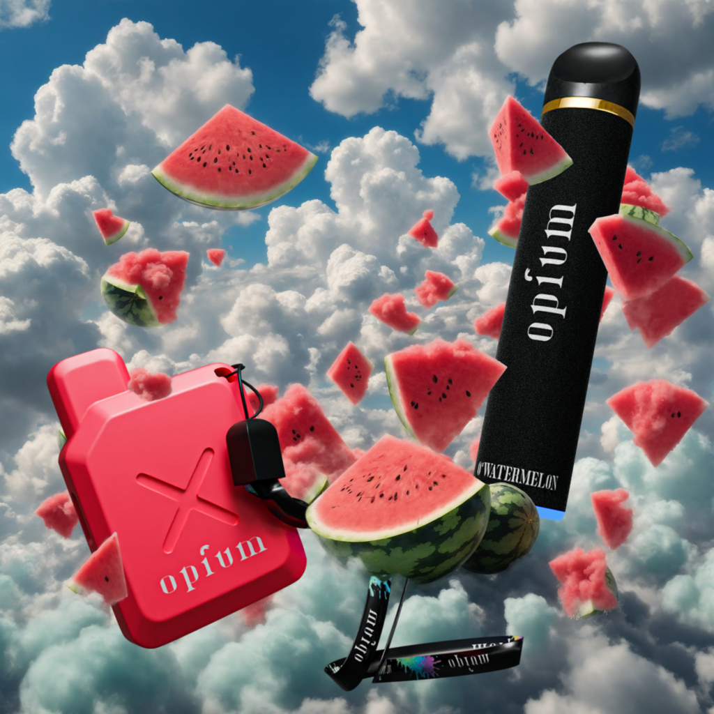
Opium Vape’s branding is characterized by its commitment to elegance and allure. We crafted a minimalist logo that embodies sophistication and modernity, using clean lines and subtle typography to convey a sense of luxury. The color palette blends deep, rich tones with metallic accents, evoking a sense of refinement and exclusivity. Our brand identity reflects Opium Vape’s dedication to delivering an exceptional vaping experience, combining style with substance to resonate with discerning consumers seeking quality and sophistication in their vaping products.

Syrrush

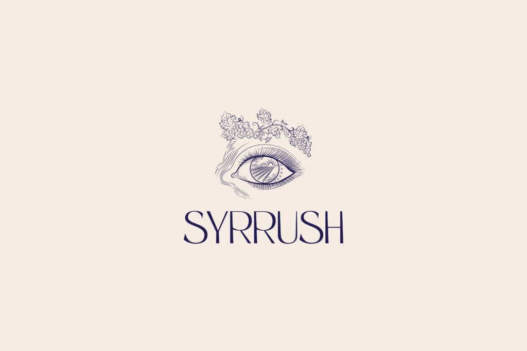
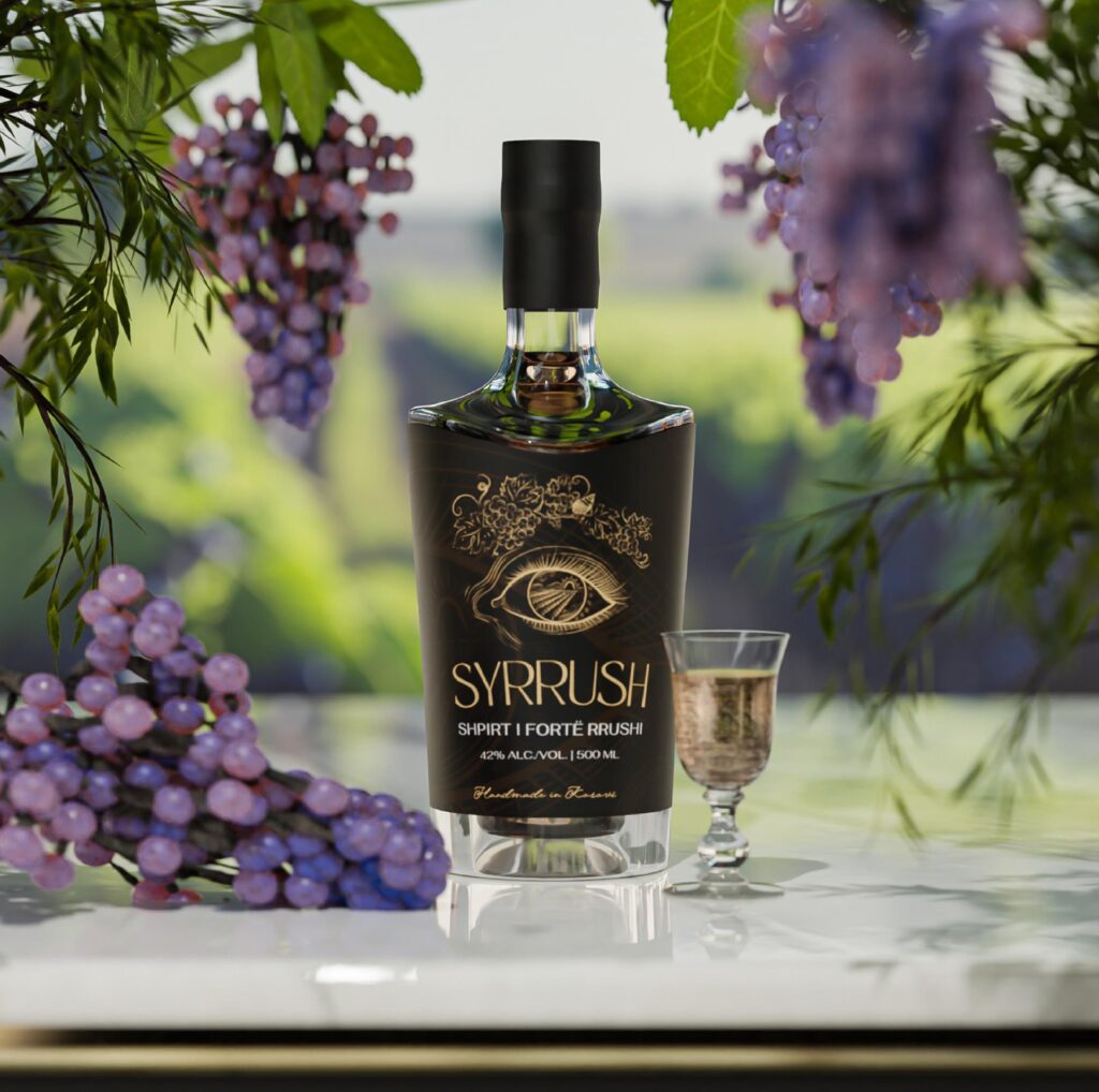
Syrrush Spirits’ branding captures the essence of artisanal craftsmanship and premium quality. Our logo design blends classic typography with a contemporary twist, reflecting tradition and innovation. The color palette harmonizes deep, rich tones with hints of gold or silver, symbolizing refinement and excellence. This visual identity is complemented by elegant packaging that showcases the spirit’s heritage and distinctive flavors. Syrrush Spirits’ brand story emphasizes its commitment to producing exceptional spirits, appealing to connoisseurs who appreciate authenticity and superior craftsmanship in every sip.

Kosova information technology

Omni Creative was instrumental in developing the branding and comprehensive marketing plan for Kosova Information Technology (KIT). Our approach emphasized KIT’s commitment to innovation, reliability, and technological advancement within the IT sector. We crafted a modern logo and cohesive visual identity that reflects KIT’s cutting-edge capabilities. Additionally, our strategic marketing strategy included targeting businesses in Kosovo and beyond, enhancing digital presence, and leveraging content marketing and social media to establish KIT as a leader in IT solutions.

KAT ARCHITECTURE

Omni Creative spearheaded the branding efforts for KAT Architecture, focusing on elegance and expertise in architectural design. Our approach included crafting a distinctive logo that blends modern aesthetics with architectural elements, symbolizing creativity and precision. The color palette combines earth tones with subtle metallic accents, reflecting KAT Architecture’s commitment to timeless design and innovation. Our branding strategy aimed to position KAT Architecture as a premier firm known for exceptional architectural solutions and client-centric service, resonating with discerning clients seeking quality and sophistication in architectural design.

MOTRAT BINJAKE

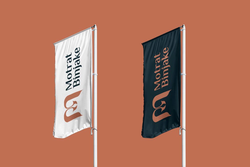
Omni Creative led the branding initiative for Motrat Binjake Restaurant, focusing on a blend of tradition and modernity in culinary experience. We developed a logo that merges classic typography with contemporary design elements, reflecting the restaurant’s heritage and innovative spirit. The color palette harmonizes warm tones with accents of green and gold, evoking a sense of warmth and luxury. Our branding strategy emphasized storytelling through visual identity and ambiance, aiming to establish Motrat Binjake as a destination for exquisite dining experiences that honor tradition while embracing culinary innovation.

ILLARIO'S CAFFE

Omni Creative crafted the branding for Illarios Caffe, blending Italian charm with contemporary flair. The logo design combines elegant typography with subtle coffee motifs, reflecting the cafe’s dedication to quality and sophistication. A color palette of rich browns and deep espresso hues adds warmth and authenticity, while accents of gold and cream convey a sense of luxury and refinement. Our branding strategy aimed to create a welcoming and upscale ambiance, ensuring that Illarios Caffe stands out as a premier destination for gourmet coffee and culinary delights, resonating with coffee enthusiasts and food connoisseurs alike.

ARONIA

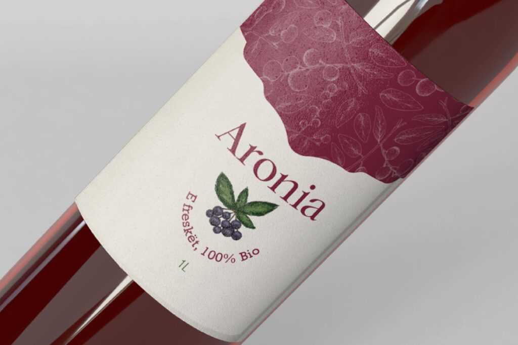
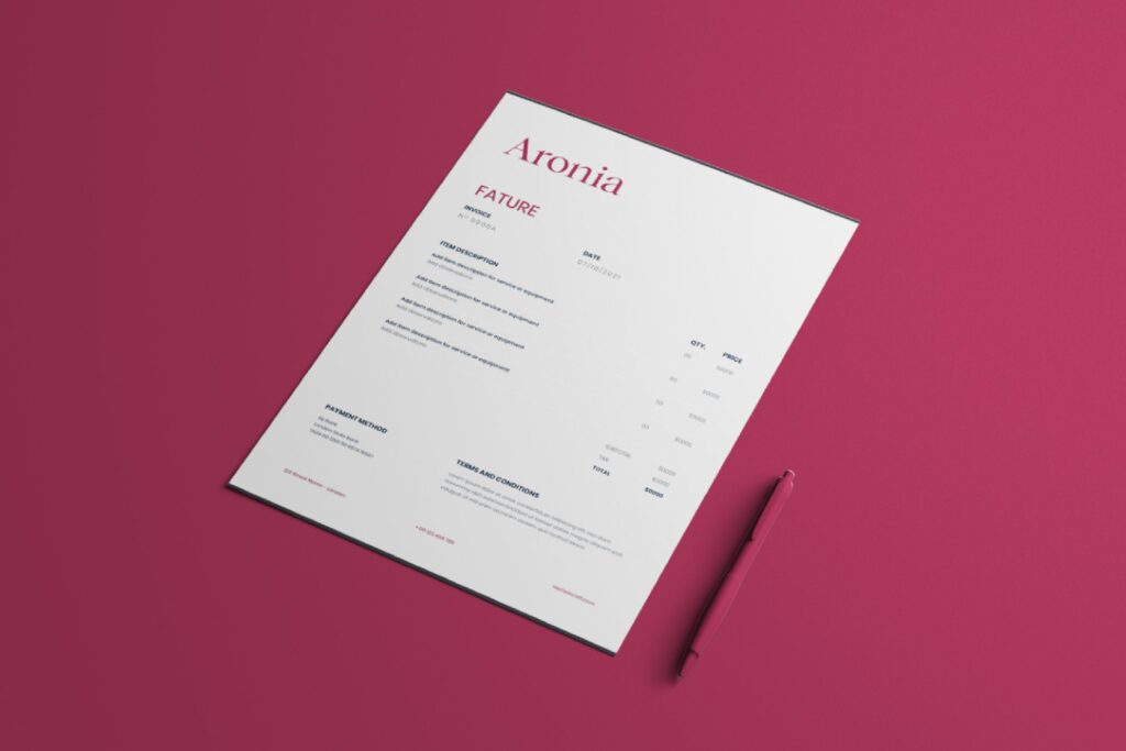
Omni Creative developed the branding for Aronia Drink, focusing on health, freshness, and natural ingredients. The logo design features clean, organic shapes and a color palette inspired by the deep purples and greens of aronia berries, symbolizing vitality and wellness. Our branding strategy included packaging that highlights the drink’s purity and nutritional benefits, appealing to health-conscious consumers. Through a cohesive visual identity and strategic messaging, Aronia Drink is positioned as a refreshing and nutritious choice in the beverage market, appealing to those seeking natural and revitalizing drink options.

SAMIR MORINA

Omni Creative spearheaded the branding for Samir Morina, focusing on professionalism and trust in legal services. The logo design integrates classic typography with a modern twist, conveying expertise and reliability. A color palette of deep blues and subtle grays adds gravitas and integrity to the visual identity. Our branding strategy emphasized clear and authoritative messaging, ensuring that Samir Morina is perceived as a knowledgeable and approachable legal expert. With a strong visual identity and cohesive branding strategy, Samir Morina stands out as a trusted advisor in the legal field, catering to clients seeking expert legal counsel and representation.